
Web Trends for 2017 – Hopes, Dreams & Everything in Between
08 Jan 2017, Posted by in Web Design, Web development
I took some time away from my blog and I’m hoping to get back into the groove this year. I haven’t stepped away from web development and I have been in the trenches working on various projects and designing and developing a few new sites that I hope to launch this year.
I haven’t written a Web Trends post since 2014. (Yikes! That’s a long time!) Looking back at the What’s Hot and What’s Not post, I realize that most of what I wrote still works for today’s websites. I think this is partly because we’ve settled into a certain look and feel that works for everybody.
Technology has certainly improved but it hasn’t changed that dramatically over the past few years. We still have mobile devices, but the main change is that most have larger screens now (and well, some explode when you don’t want them to …but that’s an entirely different article). We still have tablets, but there are certainly more of them in the hands of consumers.
Internet and mobile speeds have probably become a bit faster too… but overall the basic technology has remained fairly constant, and thus trends in web design have done the same.
Below isn’t necessarily a list of trends that I predict will happen, but rather a list of things I hope will materialize this year.
Traditional is Snuggly-Wuggly
Believe it or not, people aren’t really hip to change. We are creatures of habit, and sites have settled into what I call the “fuzzy slippers” phase.
Responsive Design Makes Sites Feel Right Across Different Devices
Responsive design is still in vogue. Full width layouts, lots of white space, scrollable content, compartmentalized sections of information are now what I would call “traditional” design. These things have become the go-to in web development for years now, and even though we continue to refine them, people are used to them.
Familiarity is Your Friend
Sites present similarly whether we see them on our large 27” Mac screen or our small mobile device. We know how to navigate, find information, load up our ecommerce cart, check out of a store, and do all of the searching, browsing, shopping, and sharing that we’ve always wanted to do without the hassle of learning something new on each site we visit.
It’s second nature now and that’s in part to a “traditional” design that has emerged and will continue to dominate in 2017.

Don’t buck the trend unless you have something really unique or unusual to share that warrants a change to the norm. In other words, “Don’t fix it if it ain’t broke!” (Something my dad always says.)
Minimalism Remains Boss but with a Twist
Minimalism is a theme that has remained constant as a web trend for the past several years. Gone are the days of in-your-face, over-the-top sites with a thousand things thrown on the screen. Sure, there are still sites out there that are cringe worthy (See below), but the majority seems to have adopted the “less is more” strategy and continued to embrace it.

A minimalist design is clean, focused and gives visitors exactly what they need. There’s nothing to hide behind. It appears factual and honest and that is what we want customers and clients to feel when they visit our site, isn’t it?
So, what about the twist?
I think minimalism will continue to be a dominate player, but we will see more unique bits showing up. Some sites border on being boring and bland. Sites often look like clones of one another, and it can be difficult to tell them apart. Sometimes it is easy to get lost in a “sea of same”.
White space, limiting the amount of content in a compartment or page, and shorter paragraphs will continue to work. Weaving distinctive design elements will set a site apart from its competition.
Distinct Artwork and Beautiful Typography
2017 is the year that being unique will pay off. Shining stars will still manage to keep sites simple while adding unique artwork and taking typography to the next level. Good designers will manage to put their unique spin on sites without impeding usability.

Custom Photos
Though stock photos can be useful and if implemented right, can help add color, interest and personality to a site, authentic photos will set a site apart from the competition. No matter what, someone else is using that stock photo that you think is uniquely yours.
Not a Professional Photographer? No Worries
Your personal photos don’t have to be artistic either. If you need a photo of people that are working in an office, pull out a camera and take pictures of the people working in your office! Even if the quality of the photo isn’t as good as a stock photo, having a one of a kind picture will add that personal touch and will allow you to connect with your audience on a whole different level.
Gradients are Beautiful
Separating content into color blocks is wonderful. It helps divide up information so it’s digestible, and it compartmentalizes the site so it’s easier to navigate and understand. Flat, solid colors have been a trend for many years now. Today, tastefully done multi-color gradient fills are starting to emerge. Subtle gradient patterns alone or placed over a photo can have a dramatic impact on design without compromising the flow of the site.

Overall, I think we will see more beauty popping into existing sites. Now that we don’t have to keep tinkering with site structure, there is more time to fine tune all of the design elements that make a site have those special touches that make clients and customers feel loved and special.
That Full Page Hero is a Zero
This is probably where I will lose some of you, but over the years I have really begun to I despise the full page hero banner concept. If you aren’t exactly sure what I’m talking about, you’ve certainly seen them all over the web. They appear as a full screen display when you arrive at the site. I’ve seen hero images described as “aesthetically pleasing banner images” displayed front and center on a site. I don’t dispute this: Aesthetically pleasing? Sure… Practical? Not so much.

The setup, if done correctly, usually features a unique photo or original artwork (see my comments above about that being a good things) displayed at the top of the page. Sometimes these hero banners will have the company mission statement or the title of the page, or even a button for an opt-in to something.
If you are an artist, musician, author, or designer and you are showcasing a piece of your work or trying to project that “wow factor” with this bold statement, then I think you are going to be able to continue to use this technique in 2017. You are excused.
If you are a business, or selling something or provide specific services where people need details about your product or work then DO NOT USE THIS! It’s annoying.
Don’t Make Customers Scroll to Content They Came to See
Most people want information when they come to your site. If you own an eCommerce site, chances are people are there to shop and buy something (which is what you want). They want to see a list of products, or perhaps sale items – they don’t need to see one big picture at the top of the screen with an arrow pointing down to the content “down there”. This is no better than the old “splash page” concept I blogged about years ago.
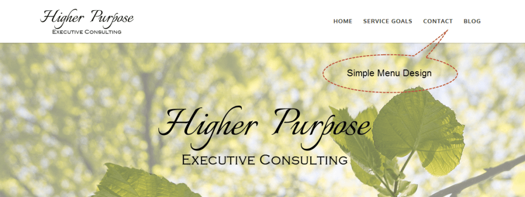
Put Your Menu on a Diet
Gone are the days of stuffing your menu with a thousand links. Users can be overwhelmed by too many menu items. The standard navigation should be limited to no more than seven to nine items. If you have a complex site with lots of products and options, you might consider using a mega menu where you can use visuals or a better layout to present navigation and links. Drop downs with tons of plain links and no visuals should remain in 2016.
Use Google Analytics for Help
This is also a good time to really think about what you are trying to accomplish with your site. Take a long hard look at all of the navigation items at the top of your page and determine if they are all needed. If you need help with this, now might be a good time to dust off your Google Analytics account and take a look at behavior patterns among visitors.
Get a Visual of User Behavior
Within Analytics the In-Page Analytics option is a good way to layer user behavior over your actual page. This will allow you to analyze what users click and where they go. You’ll need Google Chrome to access this feature, but it is well worth using to improve the functionality of your site, and serve your customers better.
Click Bait Ads Magically Disappear
I am so sick of seeing disgusting toenails and odd photo-shopped pictures of celebrities and their kids at the top and bottom of articles, and popping up when I leave a page. Even once in a while there will be something of value in those ads (like a new technique to fight a certain type of cancer) and typically those take you to a site with more ads and more click bait. Enough! I know it probably won’t happen, (and smaller sites that aren’t making that much from these ads anyway, I’m looking at you) but please stop promoting these. I understand the need to make money from your blog, but come up with a better way that serves your customer base better.
(Don’t worry, I’m not going to include any of those gross ad images here!)
Kindergarten Rules Apply – Be Nice and Don’t Lie
Finally, let’s use the rules we were all taught in Kindergarten: be nice and tell the truth. Whether you are blogging, commenting in a forum, or interacting with other people on social media, try to be nice. This doesn’t mean that you can’t communicate your thoughts and concerns. Certainly, there is a time and place for serious comments, but you don’t have to insult others and question a person’s character or attack someone in order to get your point across.

Think About What You Would Say In Person
Step back for a moment and imagine that you are standing face-to-face with the person you are about to bash online. If they were at your workplace, or eating dinner with you, or standing behind you in line at the grocery store, would you say what you are about to write?
Civility can be a wonderful thing. Let’s try to work on that for 2017.
And please, please, please…stop perpetuating untruths. Take a second and think about what crazy rumors you might be spreading. I understand it’s easy to get caught up in the moment, but take a step back and ask yourself a few simple questions.
Is the source reputable?
Does what’s being said make sense?
Can I confirm this information through other “reputable” sources?
Reputable sources typically fact check and require at least two outside sources to confirm what they are reporting. And when in doubt, leave it out. Just don’t share something if you aren’t sure about its validity.
Final Thoughts
Whether you are an online store owner, a professional blogger, a hobby site owner, or a customer, I hope that your web experience in 2017 is a good one. If you own a site, think about your goals for this year.
What are you trying to accomplish?
What do your customers want or expect from you?
Can you find ways to be more engaging?
How can you get users excited about your brand?
Continue to ask these questions throughout the year as you try to work within a traditional and minimalist framework which speaks to your customers and sets you apart from the competition.
Happy 2017!

Hi Elizabeth,
Thank you so much for writing this and showing anyone reading it what an intelligent blog with useful advice on web design looks like. You have no idea how happy reading this made me. There’s so much noise out there disguised as the “absolute best tips ever” and I read so many articles from beginning to end, hoping to learn something — or at least hoping the article is well-written enough that I can share it and provide knowledge to others — and end up wasting my time. I’m bookmaking this to share over and over again and will point anyone looking for website or web design advice your way because you are the BEST.
I especially love your advice about taking your own pictures to make your graphics truly your own. Kelsey does this a lot and I really think it gives her graphics not just an extra special look, but also an extra branded look. The KOTAW style can be found all over our house in trinkets and stationery and even the color of our paperclips (KOTAW Creamsicle, as Kelsey calls it) so Kelsey’s photo shoots for graphics can’t help but ooze our brand. Whereas it can take her days to find stock photography that gets her KOTAW seal of approval.
But your “Kindergarten Rules Apply – Be Nice and Don’t Lie” takes the cake. You say it so eloquently — kindness is so needed in the world, now more than ever. And ESPECIALLY on social media. And if we’ve learned anything from 2016, it absolutely has to be to stop spreading fake news.
I’m going to quote you because it bears repeating: “And please, please, please…stop perpetuating untruths. Take a second and think about what crazy rumors you might be spreading. I understand it’s easy to get caught up in the moment, but take a step back and ask yourself a few simple questions.
“Is the source reputable?
“Does what’s being said make since?
“Can I confirm this information through other ‘reputable’ sources?”
Yes, yes and YES!
Please keep writing! Your wit and intelligence shines through and we need more of this in 2017. You make the web — and the world — a better place just by being you.
Katherine,
Thank you so much for taking time to come and comment on my post. That means so much to me and fills my heart with joy! Thank you for taking the time to read, process and comment on everything.
I want you to know that I specifically thought about you and Kelsey and the Kotaw site when I mentioned the unique graphics and photos. Your site is so warm and inviting and has such a wonderful personal touch. You make everything have that Kotaw flair which I love!
I think graphics and photos are part of the branding process, and even if you take something that is stock footage and add something special to it, it shows your audience that you took enough time to make it special for them!
I couldn’t start 2017 out with just web design insights. I think the entire web experience includes perception, interaction, information, and sharing. If we can’t be nice to and reasonable with each other, then all that other stuff becomes pointless. Hopefully, everyone will take some time to reflect on what really matters and try to just be nice. 🙂
Again, thank you for taking the time to read, comment and say such lovely things. xoxox